In his book, How To, renowned graphic designer Michael Bierut writes:
“When we look at a well-known logo, what we perceive isn’t just a word or an image or an abstract form, but a world of associations that have accrued over time. As a result, people forget that a brand new logo seldom means a thing. It is an empty vessel awaiting the meaning that will be poured into it by history and experience. The best thing a designer can do is make that vessel the right shape for what it’s going to hold.”
Since 2013 we have built our reputation one customer at a time, on some of the hardest problems in advertising: predicting which user will become a valuable customer, which shopper will convert, which impression is worth the bid, across the open Internet where nobody controls the inventory. {[data-attribute="init-tooltip"][tooltip-content="<p>Source:<br><br>Moloco internal estimate of potential user reach, based on an average of five sample business days in March and April 2026. Reach is measured by bid requests received across Moloco's integrated exchange partners and its proprietary SDK on Android and iOS devices. Each device is assigned to a single country to prevent double-counting; tablets are excluded through deterministic classification using exchange signals and device model matching; and country-specific device-to-user calibration factors are applied.<br><br>More than 2.9 million apps: count of distinct app bundles (iOS and Android cumulative total) where Moloco received at least one RTB (real-time bid) request in the 90-day period ending April 3, 2026, worldwide.<br><br>Publisher ranking: Sensor Tower ranking of top mobile app publishers by 2025 revenue (IAP & subscription), excluding Mainland China. January 1–December 31, 2025.</p>"]} In the years since, the company has outgrown its brand. We now have the potential to reach over two billion people daily across more than 2.9 million independent apps and serve a diverse range of customers from mobile apps and connected TV to retailers and marketplaces. So earlier this year, we decided it was time to create a brand that looks like the company we really are, and a vessel big enough for our ambitions.
Today, I am pleased to officially unveil the next generation of Moloco’s brand.
The lens
RELATIONSHIP
Position and alignment
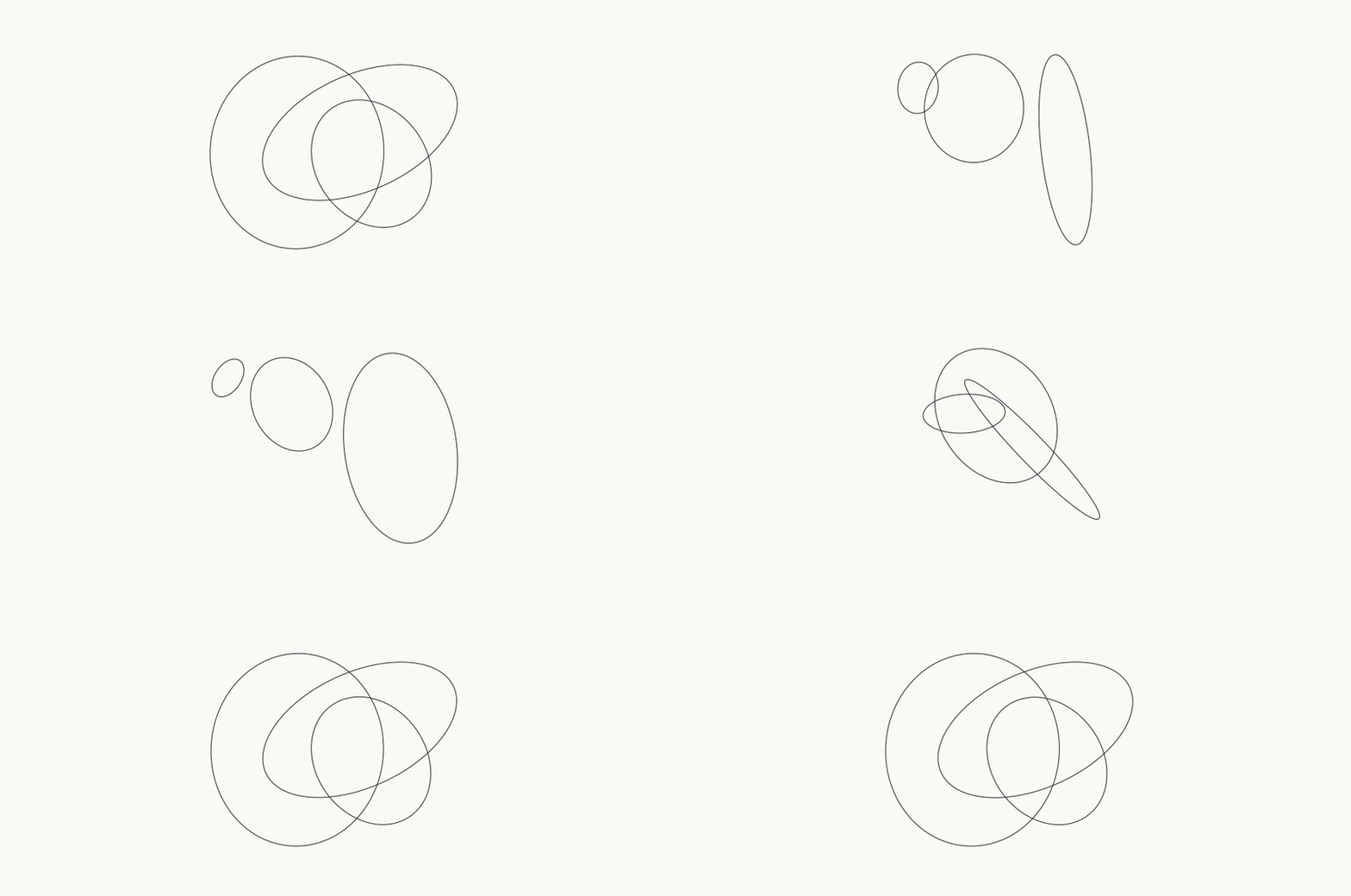
ROTATION
Single and multi-axis rotation
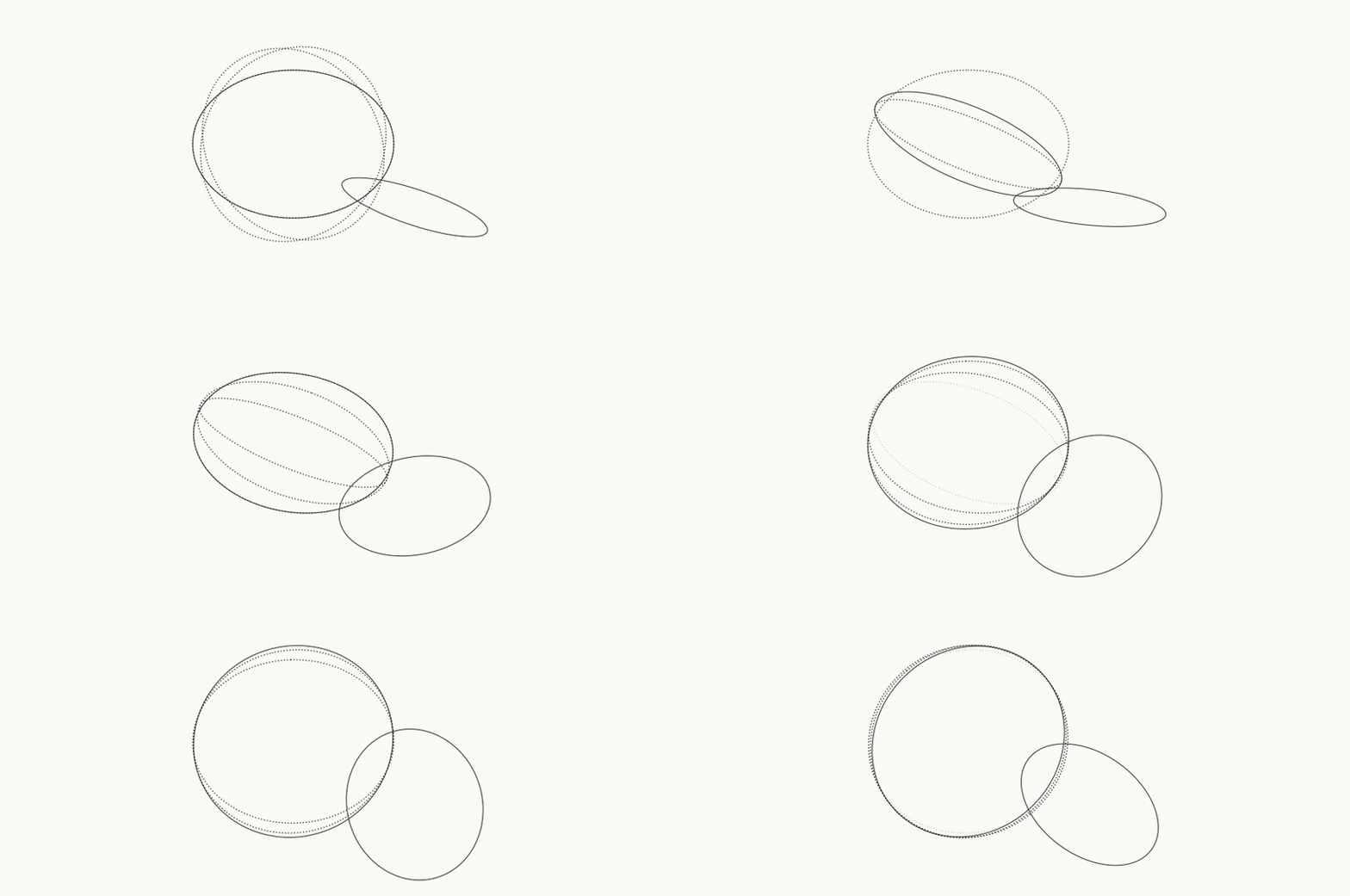
COMPOUND
System Extension & Perspective

FLYWHEEL
Shared-center rotational movement
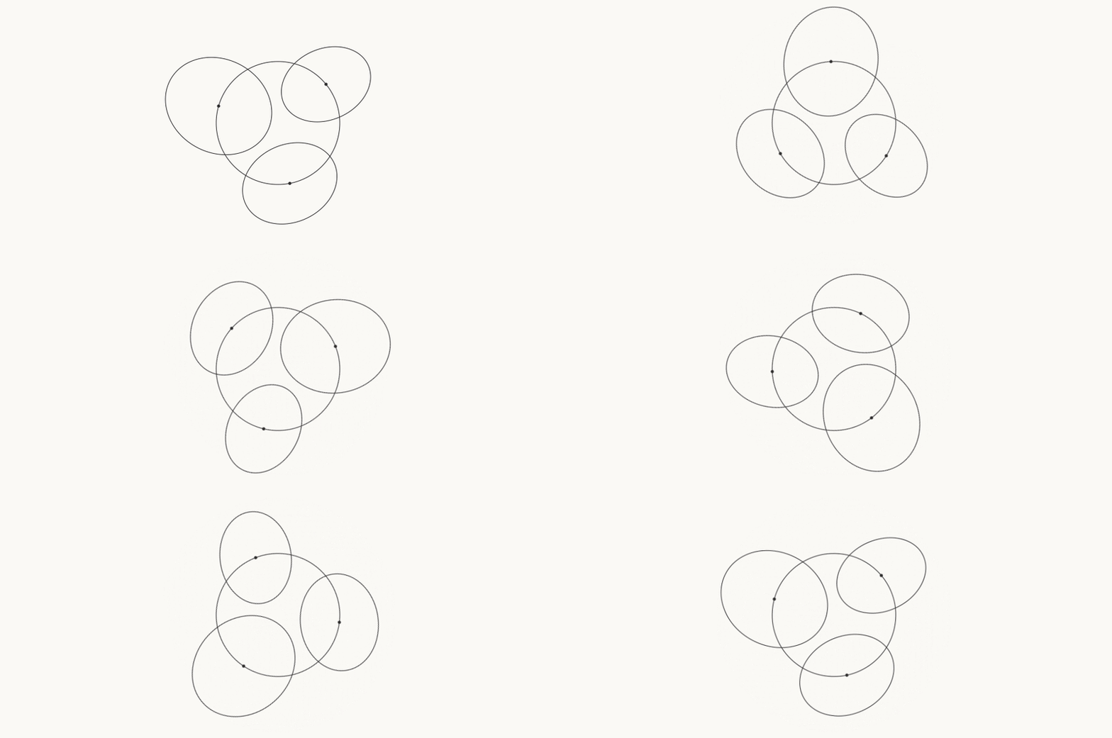
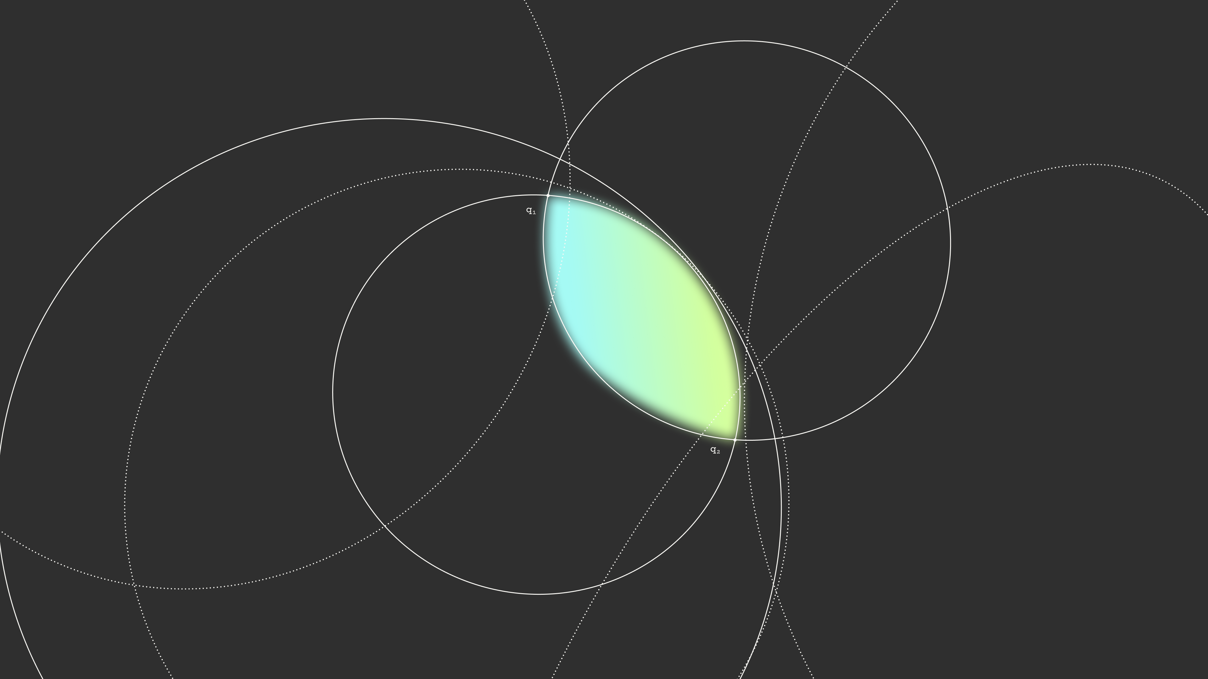
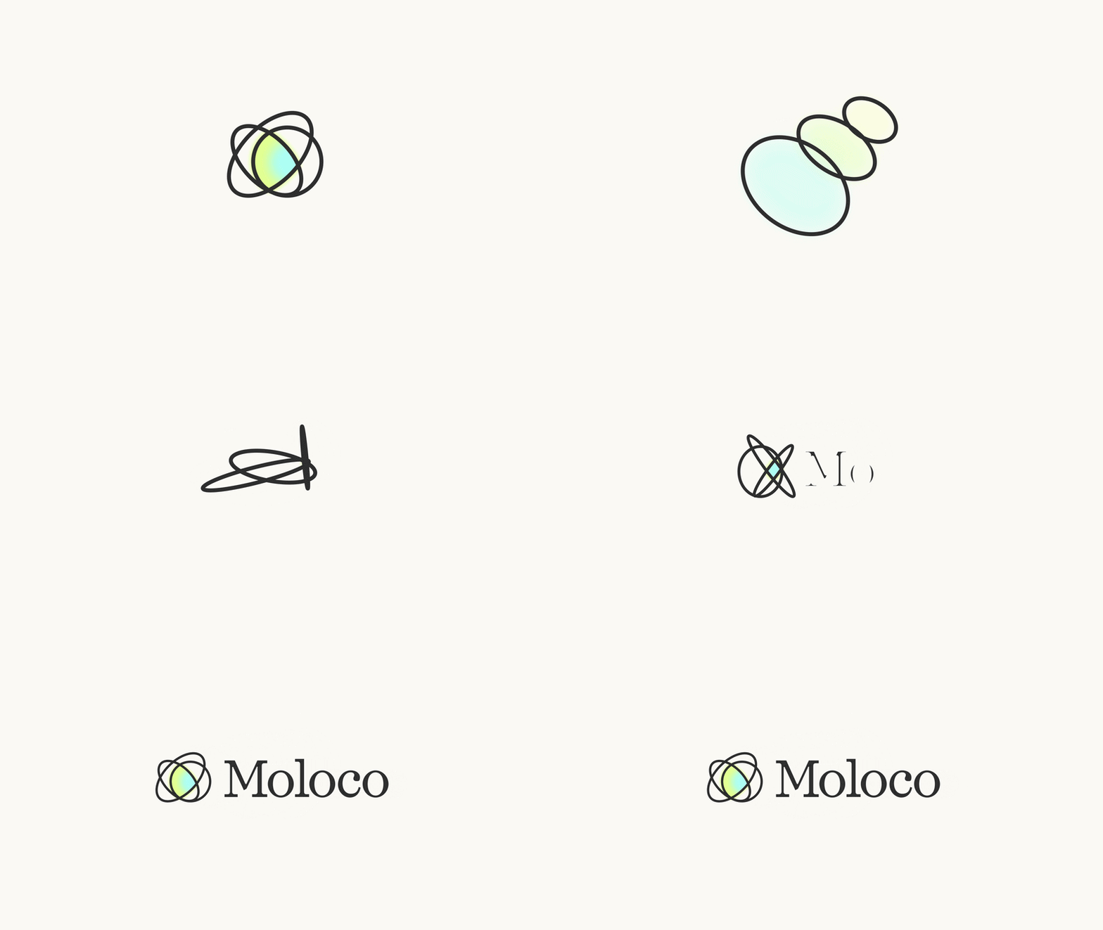
Deceptively simple at first glance, like our company, the new mark is rooted in technical detail. The three circles are lenses, each adding a perspective that sharpens the view and brings it to a focal point. Lenses are everywhere around us, from the human eye to the telescopes and microscopes behind most of what we know about the world, and they all do the same job: take a wide, scattered field of light and resolve it into something you can see clearly.
That’s what Moloco's CARA (Compound Ad Recommendation Architecture) – the AI system behind every Moloco product – does for our customers. Context from users, publishers, advertisers, and creative enters wide and scattered, and the system's specialized models narrow it, layer by layer, into one sharp decision about one ad opportunity. Each model compounds the one before it, the way each element in a lens compounds the last. The system's name begins with the word "compound" for that reason.
The lens also says something about how we show up in the world. AI is usually described as a black box. A lens is the opposite, bringing things into focus. We are committed to serving as a guide, a helpful partner who lights the way forward in the fast-moving world of AI advertising. We chose a mark that would hold us to that.
The system
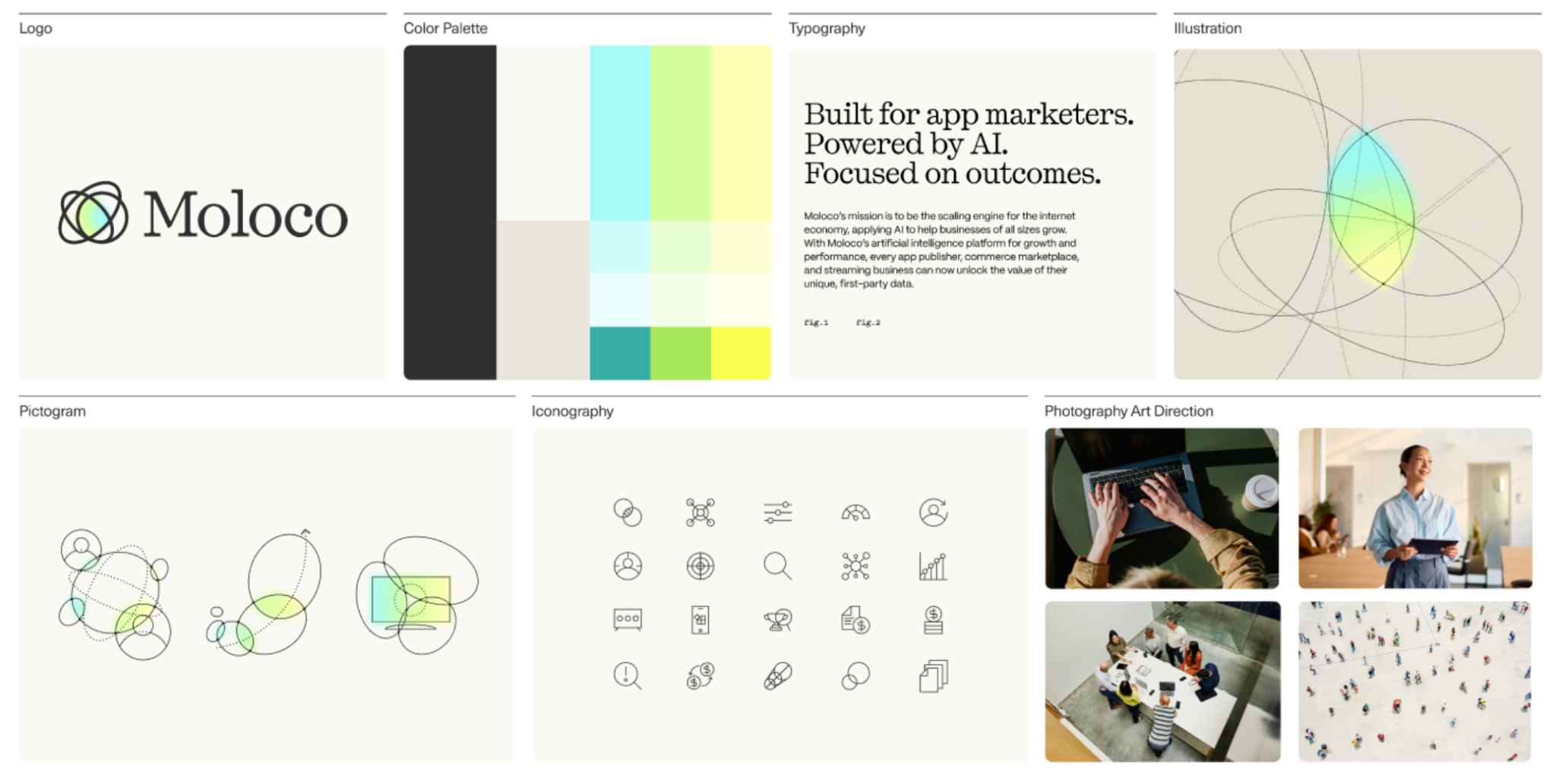
The logo is one piece of a larger system, and we designed it to work everywhere Moloco shows up. That range is wide: published research, data visualization, advertising, events, product interfaces, and a website that serves customers in seven different languages. Each of those has different demands, and a system that only looks good on a billboard would have failed most of them.
So we kept it simple. The typography, color, and lens illustrations are built to put data and content at the center of the page, with the identity framing the work rather than competing with it. We spent a long time on craft in the functional details: the fonts, the icon system, how the lenses behave. So much design now is generated and looks the same, and care in the small things is how a brand stays recognizable. And we built it for a global company from the start, with language support, local review, and type mapping for every market we publish in.
Built for the hardest problems in advertising
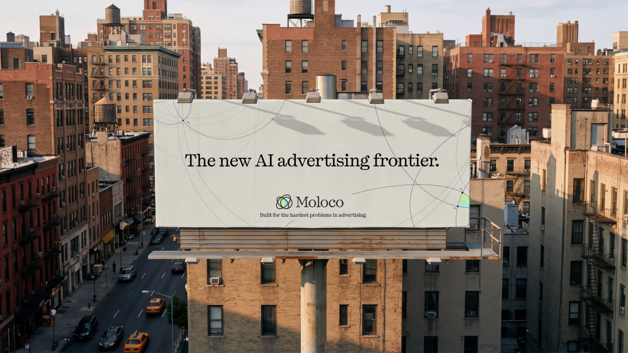
That is the one line you will see alongside the new identity, used sparingly, and it is a plain description of what we do. The open Internet is fragmented and non-uniform, with no single owner of the inventory, the data, or the measurement, and making AI advertising perform there is harder than doing it inside a walled garden. That is the problem we chose in 2013. The strategy behind the brand is that we keep going to that frontier, wherever it moves: where people spend their time, which formats perform, what the models can predict. Then we bring our customers with us. That is the meaning this brand is waiting to hold.
The new moloco.com is live today, with our story, our products, our research, and our customers' results in one place. Take a look; the frontier is waiting.
Moloco. Built for the hardest problems in advertising.
